Hey everyone!
In these next few blog posts we are going to be covering all sorts to things to help you build your brand as a musician/ music business, create and online presence and keep your fans interested in what you have to say.
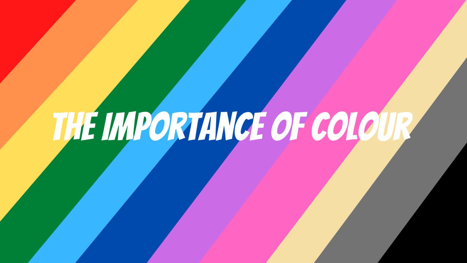
Starting with the basics: Colour
Want to build a website or create a consistent looking instagram feed? Colour is the first thing you should be thinking of. This doesn’t just apply to your online life, but also to things such as your album art and outfits. For example, if you’re from a hard-rock band, creating album art with pastel pinks and bright yellows might send confusing messages to fans.
Whether you want to plan your performance outfits, create a header for a facebook event, or even start your own music blog, I have researched the meanings behind colours so that you can use this post as a guide!
Red

Red can be linked with things such as anger, hate, and war whilst also being associated with cupid, passion, and love.
It has been shown to be able to have a physical effect on people, raising respiration rates and even blood pressure.
Orange

Unlike red, orange can be less overpowering but still have a warming effect.
It is associated with health and vitality (because of the fruit) and is seen as vibrant and inviting.
Yellow

Yellow can invoke feelings of happiness and cheerfulness. In decoration it can often be quite overpowering so use with care!
Green

Green is associated as earthy and can symbolise growth and abundance. Due to its relation to nature it can often have a calming effect.
For Blues, the association often depends on the shade:
Light Blue

Light Blue can have a calming effect and can be relaxing to look at. It can come across friendly and inviting to look at.
Bright Blue

Bright blues can invoke a feeling of excitement and can often be energising.
Dark Blue

Dark blues can create a feeling of strength and even professionalism.
They can also invoke feelings of loneliness, or even make you think about the ocean or the night sky.
Light Purple

Light purples such as lavender can be seen as romantic, showcasing feminine energy and delicateness.

Dark purples are associated with royalty and high society. Due to this, it can also indicate wealth.
Pink

Pink can invoke feelings of fun, harmony and friendship.
It is stereotypically associated with femininity, especially during youth.
Beige
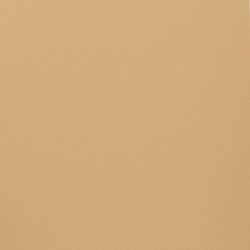
Neutral, calming and extremely versatile, beige can be used as both a background or to accent other, more vibrant colours.
Grey

Professionalism and formality are what grey brings to the table. It is often used on business websites.
Black

When used in abundance is often associated with edgier designs.
When used amongst others, is can show elegance and formality– especially when it is used for important text. On the other hand, it is also associated with death and mystery.
White

White can be associated with purity, virginity and cleanliness. It is also a key colour in bridal and the health industry.
Choosing Your Colours
When its time to choose which colour to associate with your brand as a musician/ music business, try to keep these associations in mind. First impressions are made quickly so the colours you choose will stick in a viewers head. I chose black and pink for the accents of this website because I enjoy the elegance of black and want to spread some fun with the pink!
Did you find this guide useful? Let me know down in the comments!
Thanks! x
